Adding editor tabs and script commands
If your library adds a type or some functions, anyone using it has to know which attributes to set and which functions to call. You can do better than that: a library can add its own tab to the object editor, and its own script commands to the “Add Script Command” list, so its features are used by filling in boxes like any built-in feature.
| You want | Add |
|---|---|
| Boxes for the attributes your type uses, on the object that has it | a <tab> |
| Your library’s functions to appear in the script adder | an <editor> |
Both are written as XML, so some familiarity with XML (or HTML) is useful, and both use the same <control> elements. The core library is built the same way: src/Engine/Core/CoreEditor*.aslx in the source code is one long worked example of everything on this page.
Put your type in a library
Section titled “Put your type in a library”Libraries are covered in Using and creating libraries - in short, create a text file with a <library> root element, then add it to your game by clicking Advanced at the bottom of the tree and then Add Library, and reload the editor when the banner asks you to.
It is worth putting an XML declaration first, so you can check the file with an online XML validator if the code ever gets so broken that Quest Viva cannot load it:
<?xml version="1.0"?><library></library>The examples on this page build a “spell” type and a specialised “attackspell” that inherits from it. Everything goes between the <library> tags. If the type already exists in your game, cut it out of the raw XML code view and paste it here - taking everything from the opening tag to the closing tag, whole lines only:
<?xml version="1.0"?><library>  <verb>    <property>learn</property>    <pattern>learn</pattern>    <defaultexpression>"You can't learn " + object.article + "."</defaultexpression>  </verb>
  <type name="spell">    <inventoryverbs type="stringlist">Cast</inventoryverbs>    <displayverbs type="stringlist">Learn</displayverbs>    <drop type="boolean">false</drop>    <take type="boolean">false</take>    <usedefaultprefix type="boolean">false</usedefaultprefix>    <learn type="script"><![CDATA[      if (not this.parent = game.pov) {        this.parent = game.pov        msg ("In a process that seems at once unfathomable and yet familiar, the spell fades away, and you realise you can now cast the <i>" + this.alias + "</i> spell.")      }      else {        msg ("You already know that one.")      }    ]]></learn>  </type>
  <type name="attackspell">    <inherit name="spell" />  </type></library>
Add the library to your game, reload the editor, and check the game still works before going any further.
A simple tab
Section titled “A simple tab”Attack spells use different elements and have different power ratings, so they need powerrating and element attributes. Rather than make the author add those by hand on the Attributes tab, give them a tab of their own. Paste this into the library, before the closing </library> tag:
<tab>  <parent>_ObjectEditor</parent>  <caption>Spell</caption>  <mustnotinherit>editor_room; defaultplayer</mustnotinherit>
<control> <controltype>dropdowntypes</controltype> <caption>Spell type</caption> <types>*=Not a spell; spell=Non-attack spell; attackspell=Attack spell</types> <width>150</width> </control></tab><parent>says which editor the tab belongs to._ObjectEditoris the one you see when you select an object.<caption>is the name on the tab. Your tabs appear after the built-in ones.<mustnotinherit>keeps the tab off rooms and the player object. The types are separated by semicolons.- The one control is a dropdown letting the author say whether this object is a spell, an attack spell, or neither.
*is the “none of them” choice, and it has to be there.
Quest Viva reads libraries when the game is loaded, so after editing the library you need to reload the editor before the tab appears - click “Reload” in the banner. Select an object and you should see a new “Spell” tab.
More controls
Section titled “More controls”A tab can have as many controls as you like. Here is one for the power rating:
<control> <controltype>number</controltype> <caption>Power of attack (1-10)</caption> <attribute>powerrating</attribute> <width>100</width> <mustinherit>attackspell</mustinherit> <minimum>0</minimum> <maximum>10</maximum></control><attribute> names the attribute the control sets - every control that edits a value needs one. <width> is the control’s width in pixels; leave it out and the control fills the space available. <mustinherit> means this one is only shown for attack spells. <minimum> and <maximum> bound the spinner, but they only apply to this control - a script, or a hand-edited attribute, can still put the value outside that range, so don’t rely on it.
A text box for the description, shown for both kinds of spell because attackspell inherits spell:
<control> <controltype>textbox</controltype> <caption>Description</caption> <attribute>description</attribute> <mustinherit>spell</mustinherit></control>And a dropdown for the element:
<control> <controltype>dropdown</controltype> <caption>Element</caption> <attribute>element</attribute> <validvalues type="simplestringlist">none;Fire;Frost;Storm</validvalues> <mustinherit>attackspell</mustinherit></control>It is generally a good idea to give your type a sensible default value for each attribute your tab edits.
Showing a control only when it applies
Section titled “Showing a control only when it applies”Keeping the editor tidy matters: a tab crowded with controls that don’t apply is worse than no tab. Three elements control visibility, and all three work on a whole <tab> or on a single <control>.
<mustinherit> shows it only for objects of the given type (or types, separated by semicolons):
<tab> <parent>_ObjectEditor</parent> <caption>My new tab</caption> <mustinherit>container</mustinherit></tab><mustnotinherit> hides it for the given types - here, for rooms and the player object:
<tab> <parent>_ObjectEditor</parent> <caption>My new tab</caption> <mustnotinherit>editor_room; defaultplayer</mustnotinherit></tab>Used inside a control, these let the author pick a type on your dropdowntypes control and watch the relevant controls appear.
<onlydisplayif> takes a condition written in Quest Viva code, with this being the object being edited. Anything you could put in an if works. These examples come from the core library:
<onlydisplayif>game.feature_annotations</onlydisplayif>
<onlydisplayif>not this.lookonly</onlydisplayif>
<onlydisplayif>GetInt(this, "keycount") > 2</onlydisplayif>
<onlydisplayif>(GetBoolean(this, "locked") or not GetBoolean(this, "visible"))</onlydisplayif>
Add <advanced/> to a control to tuck it into the collapsed Advanced section at the bottom of the tab, rather than hide it altogether. That is the right home for anything most authors won’t need.
Control types
Section titled “Control types”Every <control> needs a <controltype>, and almost all of them need a <caption> (the label the author sees) and an <attribute>. The rest of the elements listed here are optional extras for that control type.
| Control type | Edits | Useful extras |
|---|---|---|
title |
nothing - a heading within the tab | |
label |
nothing - a line of explanatory text | <bold/> |
checkbox |
a boolean | |
textbox |
a string, on one line | <nullable/> |
richtext |
a string, with formatting buttons and text processor help | <expand/>, <nullable/> |
number |
an int | <minimum>, <maximum>, <increment> |
numberdouble |
a double | <minimum>, <maximum>, <increment> |
dropdown |
a string chosen from a list | <validvalues>, <freetext/> |
dropdowntypes |
which of your types the object inherits | <types> (no <attribute>) |
objects |
an object, chosen from the objects in the game | |
file |
a file from the game’s assets | |
list |
a stringlist | <editprompt> |
stringdictionary |
a stringdictionary | <keyprompt>, <valueprompt> |
scriptdictionary |
a scriptdictionary | <keyprompt> |
script |
a script | |
multi |
an attribute whose type the author chooses | <types>, <editors>, <checkbox>, <selfcaption> |
elementslist |
the object’s child elements | <elementtype>, <objecttype>, <expand/> |
attributes |
the full attributes table | <expand/> |
expression |
a script command’s parameter (see Script commands) | <simple>, <simpleeditor>, <source> |
A few more exist - exits, verbs, gameid, filter, texteditor, gamebookoptions - but they drive specific built-in tabs and aren’t much use in a library.
Text, booleans, numbers and scripts
Section titled “Text, booleans, numbers and scripts”<control> <controltype>title</controltype> <caption>Colour</caption></control>
<control> <controltype>label</controltype> <caption>You can use any valid HTML colour name</caption></control>
<control> <controltype>checkbox</controltype> <caption>Underline hyperlinks</caption> <attribute>underlinehyperlinks</attribute></control>
<control> <controltype>number</controltype> <caption>Font size</caption> <attribute>menufontsize</attribute></control>
<control> <controltype>objects</controltype> <caption>Key</caption> <attribute>key</attribute></control>
<control> <controltype>script</controltype> <caption>Start script</caption> <attribute>start</attribute></control>For a string the author should be able to format, use richtext instead of textbox. Adding <expand/> lets the text area grow to fill the tab:
<control> <controltype>richtext</controltype> <caption>Description</caption> <attribute>description</attribute> <expand/></control>Lists and dictionaries
Section titled “Lists and dictionaries”A list control edits a stringlist. Give it an <editprompt>, the text shown when the author adds or edits an item:
<control> <controltype>list</controltype> <caption>Parameters</caption> <attribute>paramnames</attribute> <editprompt>Please enter a parameter name</editprompt></control>A stringdictionary needs two prompts:
<control> <controltype>stringdictionary</controltype> <caption>Status attributes</caption> <keyprompt>Please enter the attribute name</keyprompt> <valueprompt>Please enter the format string (blank for default)</valueprompt> <attribute>statusattributes</attribute></control>Dropdowns
Section titled “Dropdowns”A plain dropdown sets a string attribute from <validvalues>. Add <freetext/> and the author can type a value that isn’t in the list:
<control> <controltype>dropdown</controltype> <caption>Category</caption> <attribute>category</attribute> <validvalues type="simplestringlist">Comedy;Educational;Fantasy;Historical</validvalues> <freetext/></control><validvalues> can also be a string dictionary, in which case the key is stored in the attribute and the value is what the author sees.
A dropdowntypes control is different: it sets which type the object inherits, rather than an attribute, so it has no <attribute> element. The <types> element is a string dictionary of type name to label:
<control> <controltype>dropdowntypes</controltype> <caption>Container type</caption> <types>*=Not a container; container_open=Container; container_closed=Closed container</types></control>* means “none of these”, and it must be present. Every other type listed has to be defined somewhere in the game - ideally in this same library.
The multi control
Section titled “The multi control”Sometimes the author should decide what type the attribute is - a message, or a script, or nothing at all. That’s what multi is for. Its <types> element is a string dictionary of attribute type to label:
<control> <caption>Look</caption> <controltype>multi</controltype> <attribute>look</attribute> <types> null=No description; string=Text; script=Run script </types> <editors> string=textbox </editors></control><editors> says which control to use for a given type. textbox is the default for a string, so it isn’t strictly needed here; richtext is the alternative.
When one of the types is boolean, use <checkbox> to give the checkbox its own label:
<control> <controltype>multi</controltype> <caption>Take</caption> <attribute>take</attribute> <types> boolean=Default behaviour; script=Run script </types> <checkbox>Object can be taken</checkbox></control>The types a multi control can offer are null, string, boolean, script, scriptdictionary and simplepattern. <selfcaption> labels the type dropdown itself rather than the control as a whole, and <source>object</source> makes a scriptdictionary option pick its keys from the game’s objects rather than free text:
<control>  <controltype>multi</controltype>  <selfcaption>Action</selfcaption>  <attribute>useon</attribute>  <types>    null=None; scriptdictionary=Handle objects individually; string=Print a message  </types>  <source>object</source></control>
<control>  <controltype>multi</controltype>  <caption>Pattern</caption>  <attribute>pattern</attribute>  <types>    simplepattern=Command pattern; string=Regular expression  </types></control>
Element lists
Section titled “Element lists”An elementslist control lists the object’s child elements rather than an attribute - the turn scripts or commands defined inside it, say - and lets the author add and remove them:
<control> <caption>Turn scripts - run after every turn the player takes in this room</caption> <controltype>elementslist</controltype> <elementtype>object</elementtype> <objecttype>turnscript</objecttype></control>This is what the built-in Objects and Room tabs use. It is rarely what a library wants, since those elements are easier to create from the tree.
Script commands for your functions
Section titled “Script commands for your functions”The other half of the job is the script adder. If your library defines a function, an <editor> element puts it in the “Add Script Command” list, with controls for its parameters, so it can be added without writing code.
This is how the core library’s own script commands are defined. Here is the one for EnableTimer:
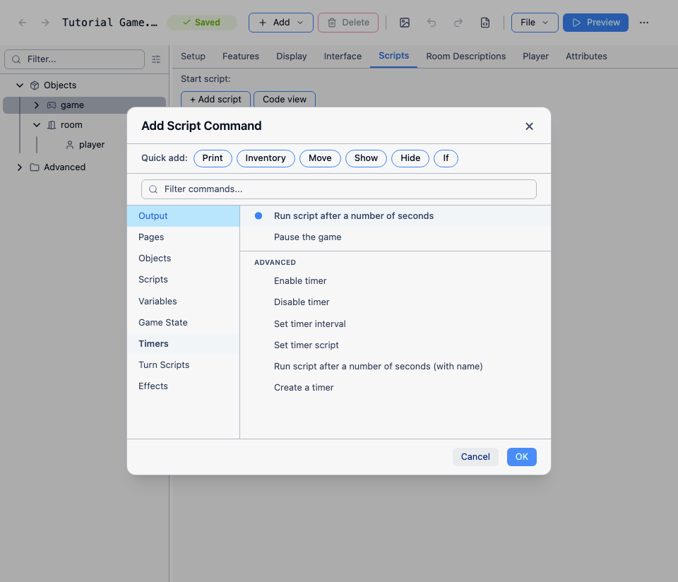
<editor>  <appliesto>(function)EnableTimer</appliesto>  <display>Enable timer #0</display>  <category>Timers</category>  <create>EnableTimer ()</create>  <add>Enable timer</add>
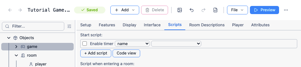
  <control>    <controltype>label</controltype>    <caption>Enable timer</caption>  </control>
<control> <controltype>expression</controltype> <attribute>0</attribute> <simple>name</simple> <simpleeditor>objects</simpleeditor> <source>timer</source> </control></editor>| Element | What it does |
|---|---|
appliesto |
the function this editor is for, in the form (function)YourFunctionName |
display |
how the command reads in the script list. #0, #1 and so on are replaced by the parameter values |
category |
which category it appears under in the adder |
add |
how the command is described in the adder |
create |
the blank command inserted when the author picks it |
advanced |
put it in the adder’s collapsed “Advanced” group |
That adds “Enable timer” to the “Timers” category:
And the two controls - a label reading “Enable timer” and an expression control offering the game’s timers - make up the command itself:
Inside an <editor>, a control’s <attribute> is the parameter number, counting from zero, rather than an attribute name. A control with no <attribute> (a label) is just text.
Most controls in a script command are expression, because any parameter can be given an arbitrary expression. <simple> is the label for the friendlier alternative offered next to it, and <simpleeditor> says what that alternative looks like: textbox, boolean, dropdown (with <validvalues>, optionally <freetext/>), number, numberdouble (both with <minimum>, <maximum> and <increment>), objects or file. With objects, <source> narrows the list to elements of one kind, such as timer above. The other control types that work in a script command are label, textbox, richtext, checkbox, dropdown, list, scriptdictionary and script.